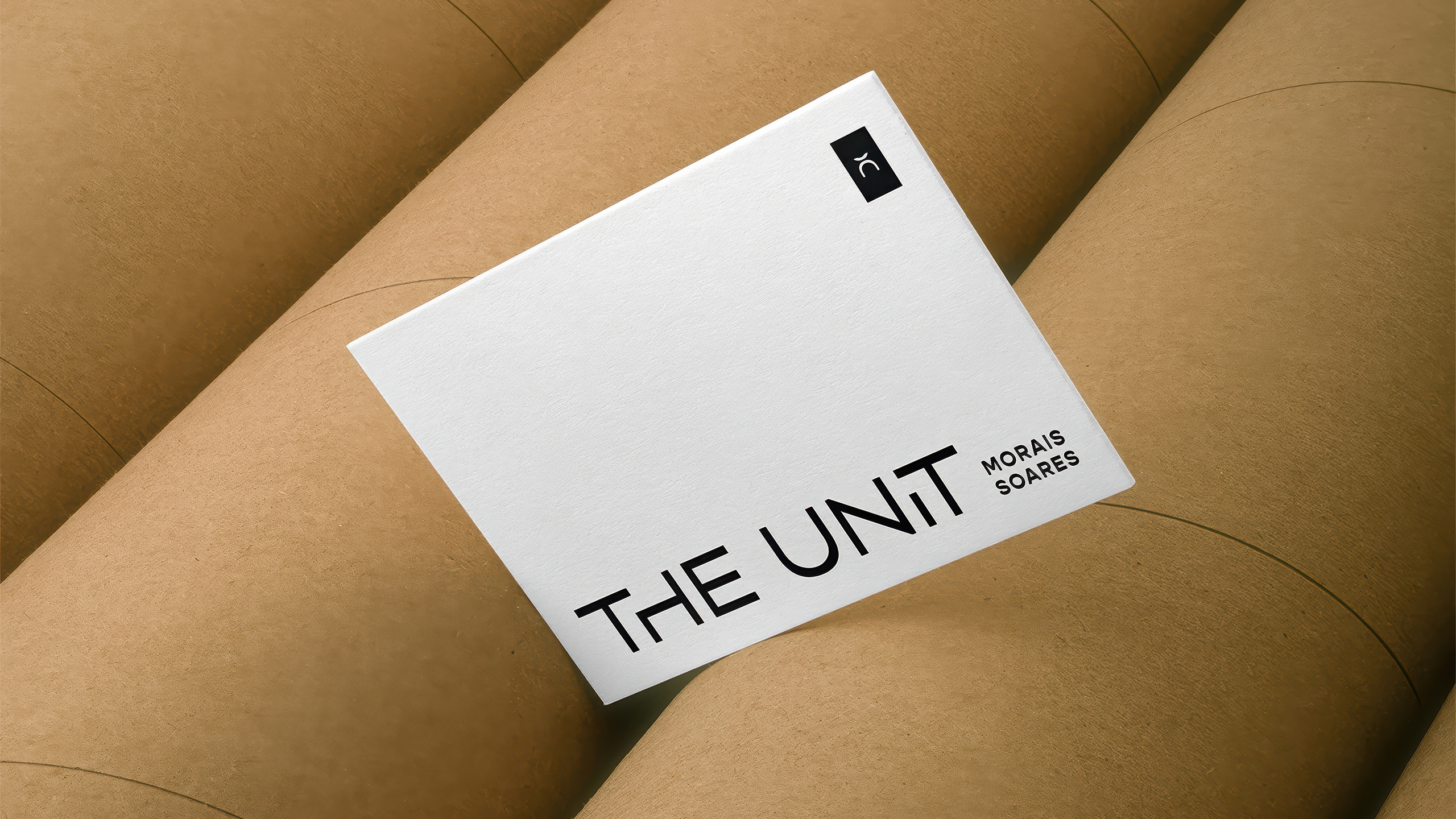
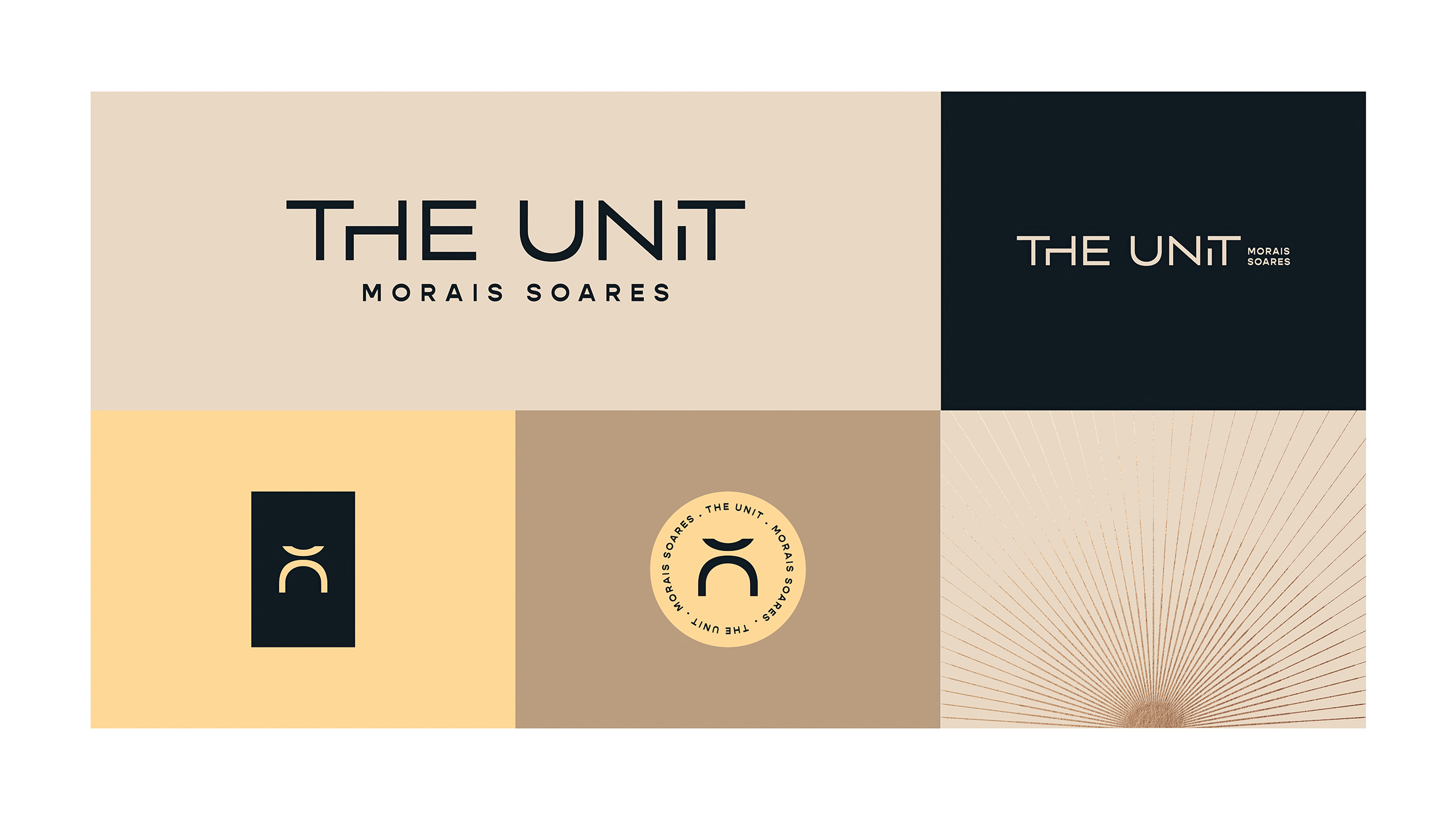
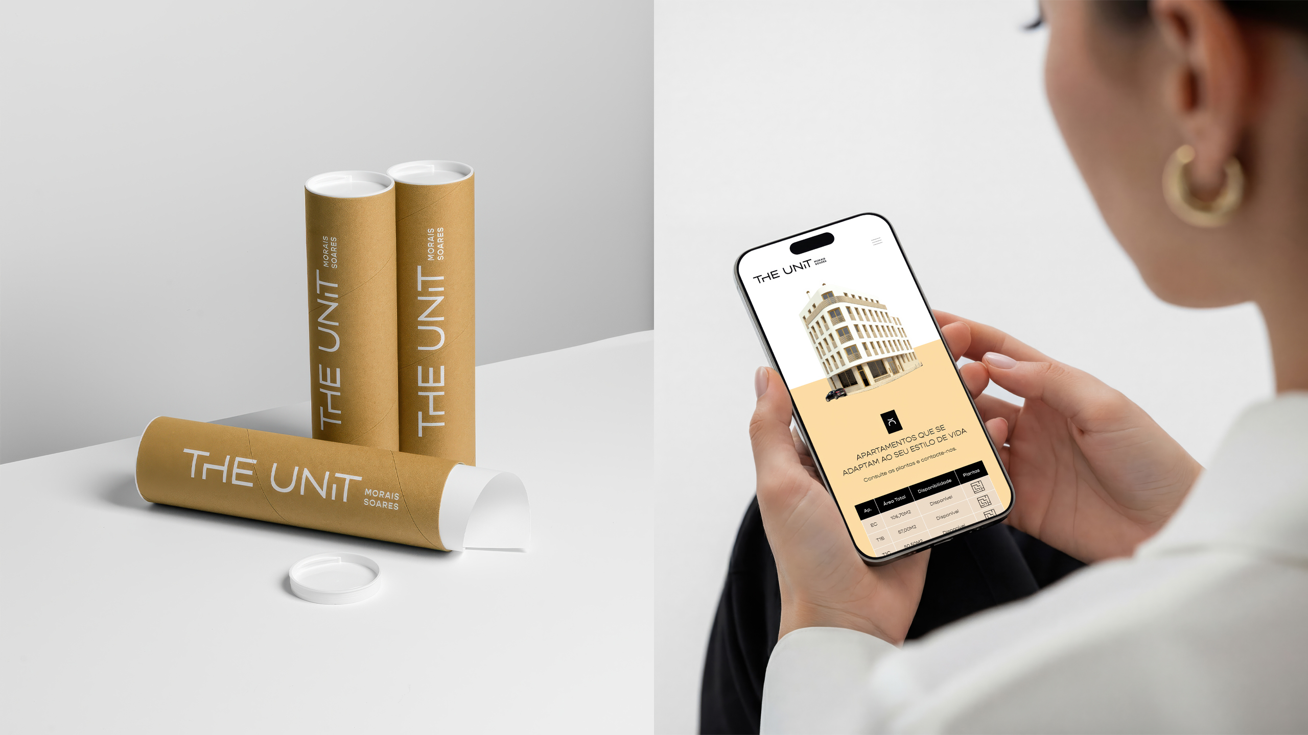
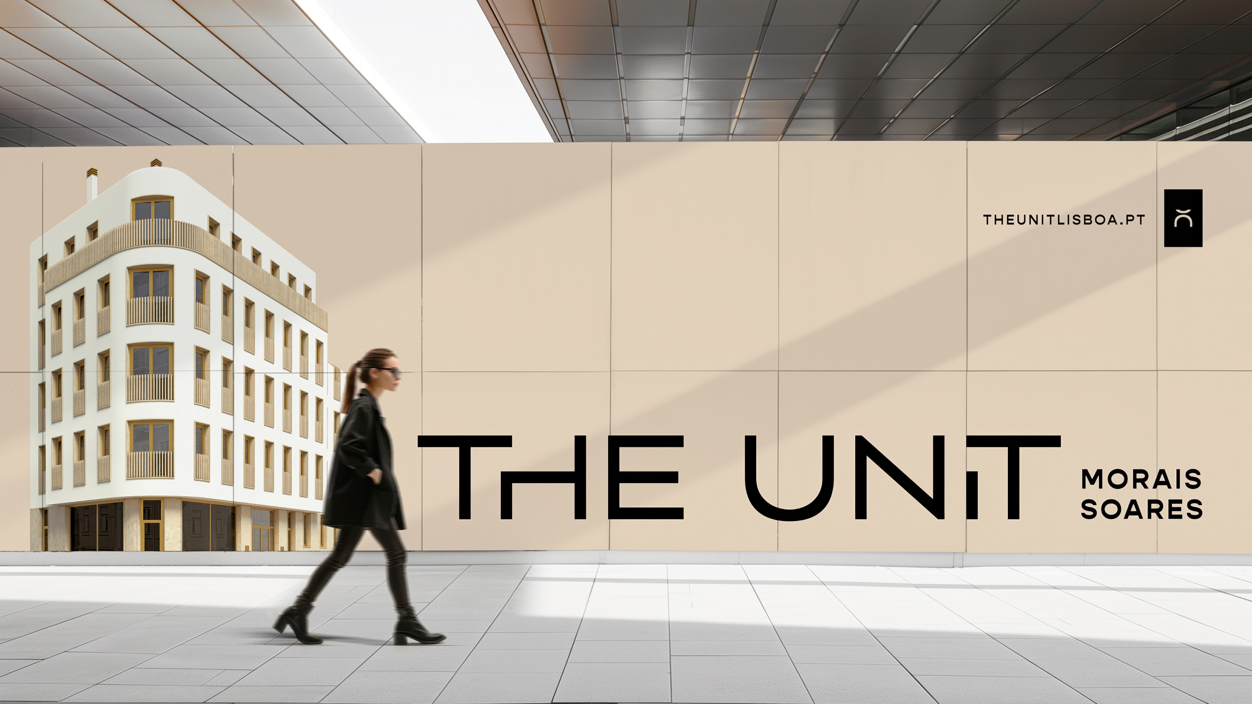
The Unit Morais Soares was conceived as a contemporary urban statement in one of Lisbon’s most dynamic streets. The name reinforces individuality within the city grid, positioning the project as a smart design driven investment for young professionals and modern families, bringing fresh energy to central Lisbon.
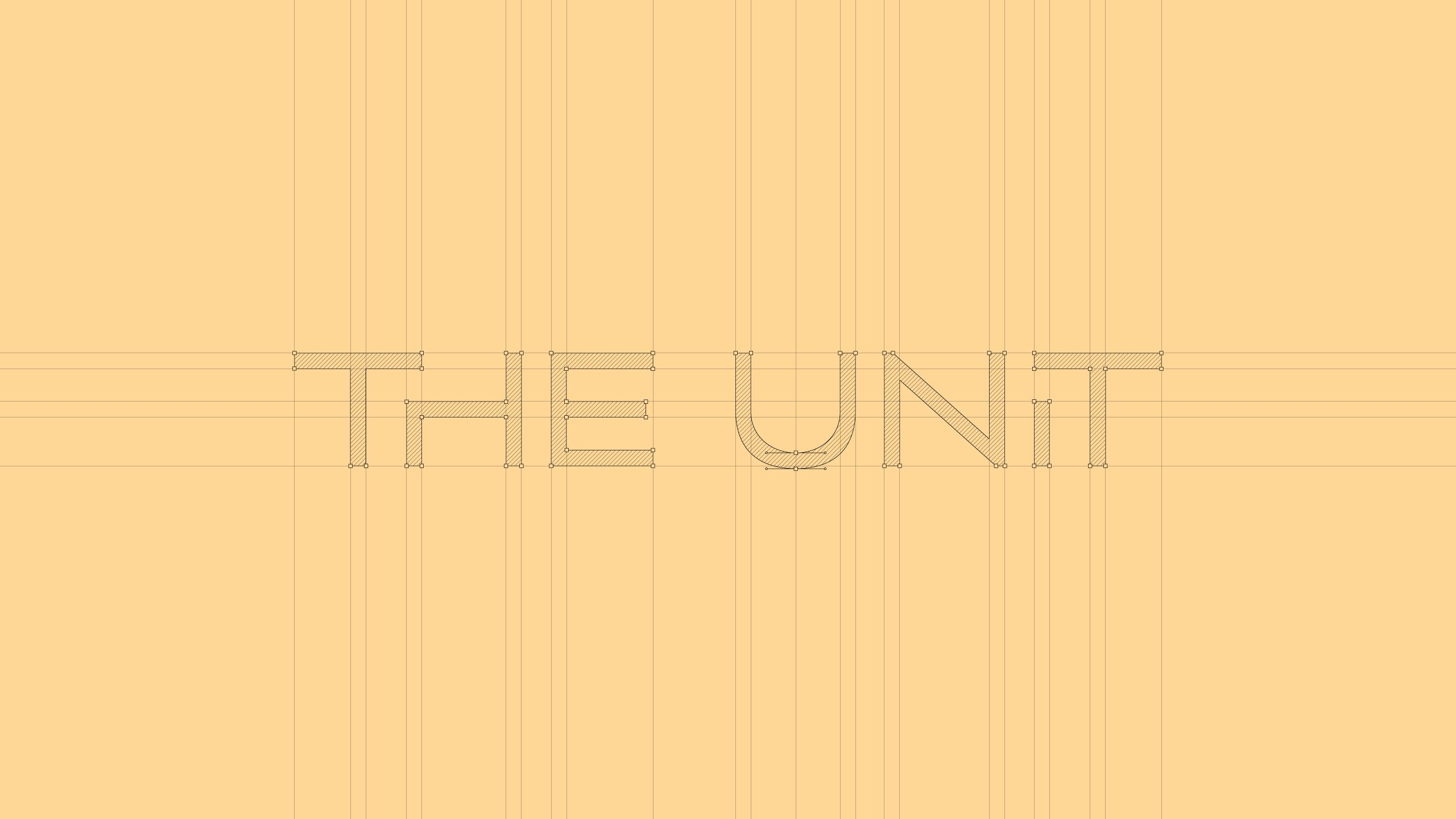
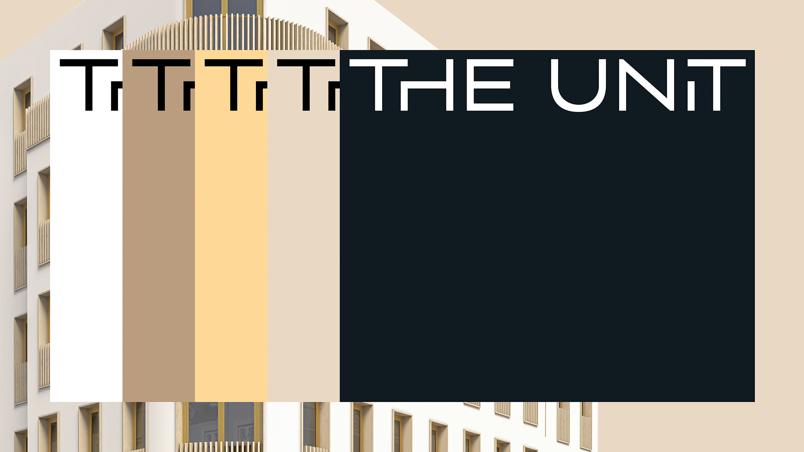
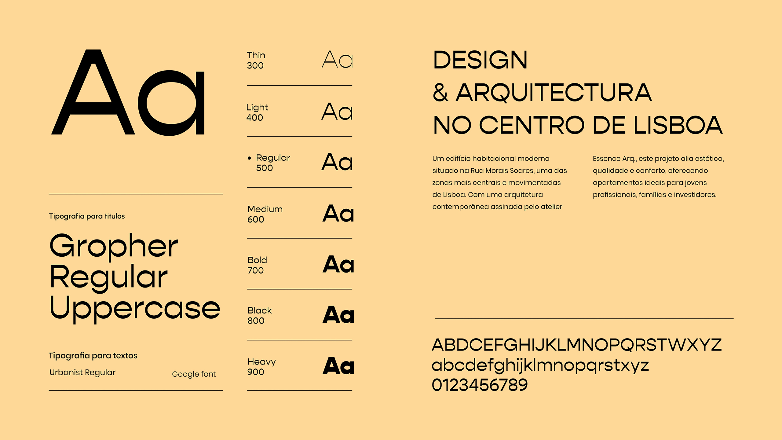
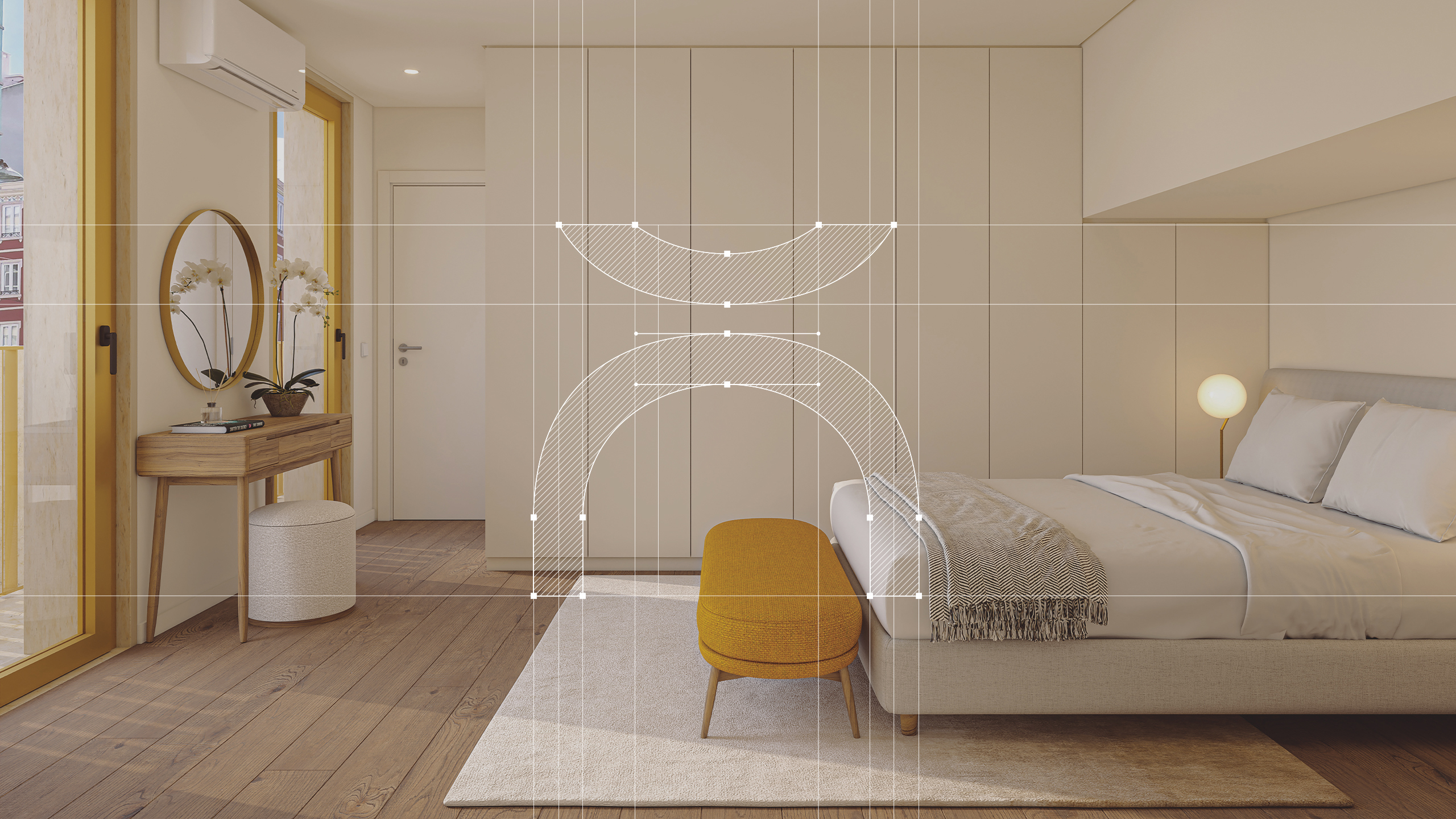
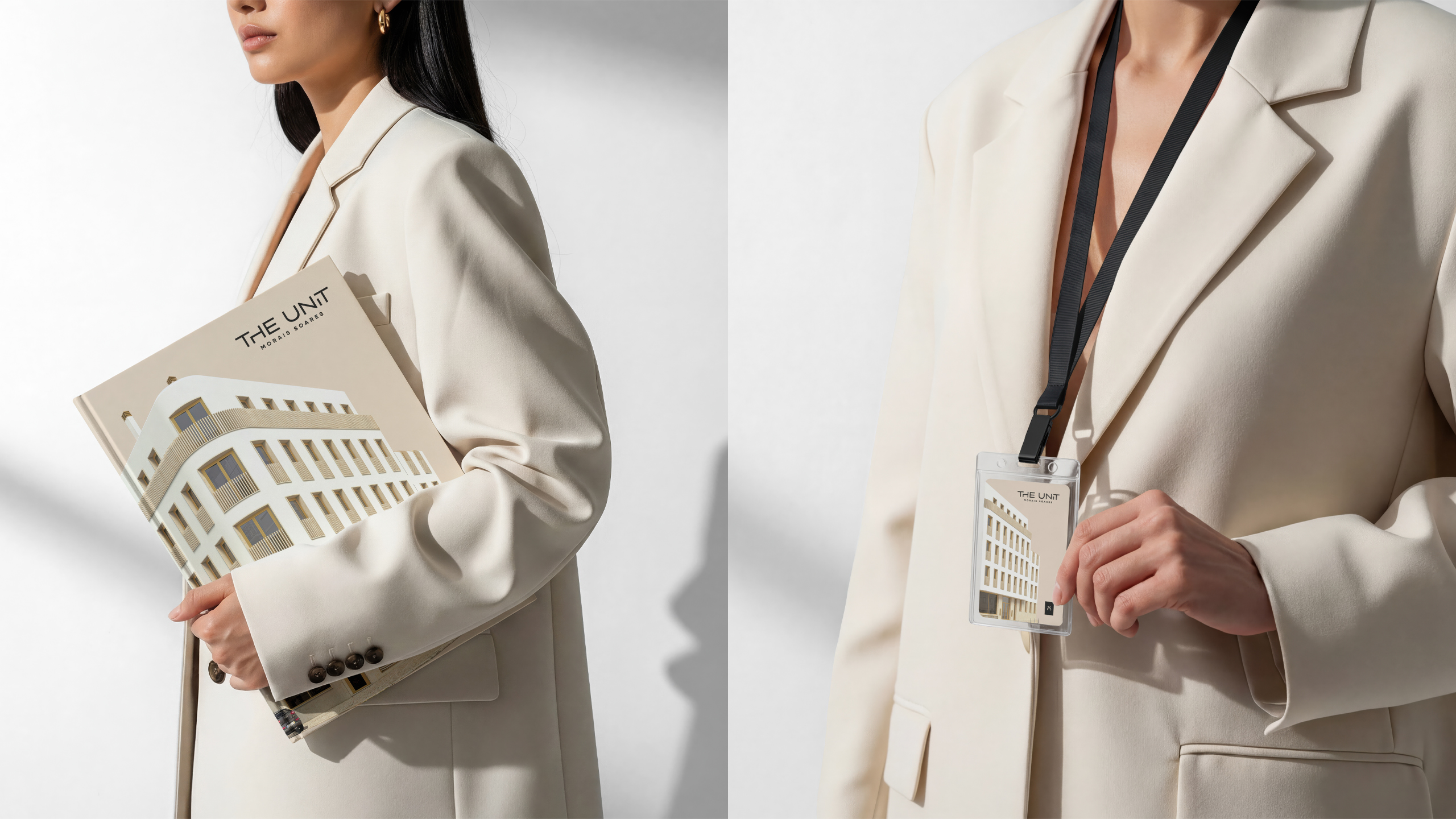
The visual identity merges the letters U and T into a bold geometric symbol inspired by the building’s curved façade. A vibrant palette of yellow, black and gold creates strong contrast and urban warmth. Hyper realistic 3D renderings enhance this atmosphere, while the brochure and floor plans were designed with graphic precision, structured grids and refined typography to ensure clarity and visual consistency.
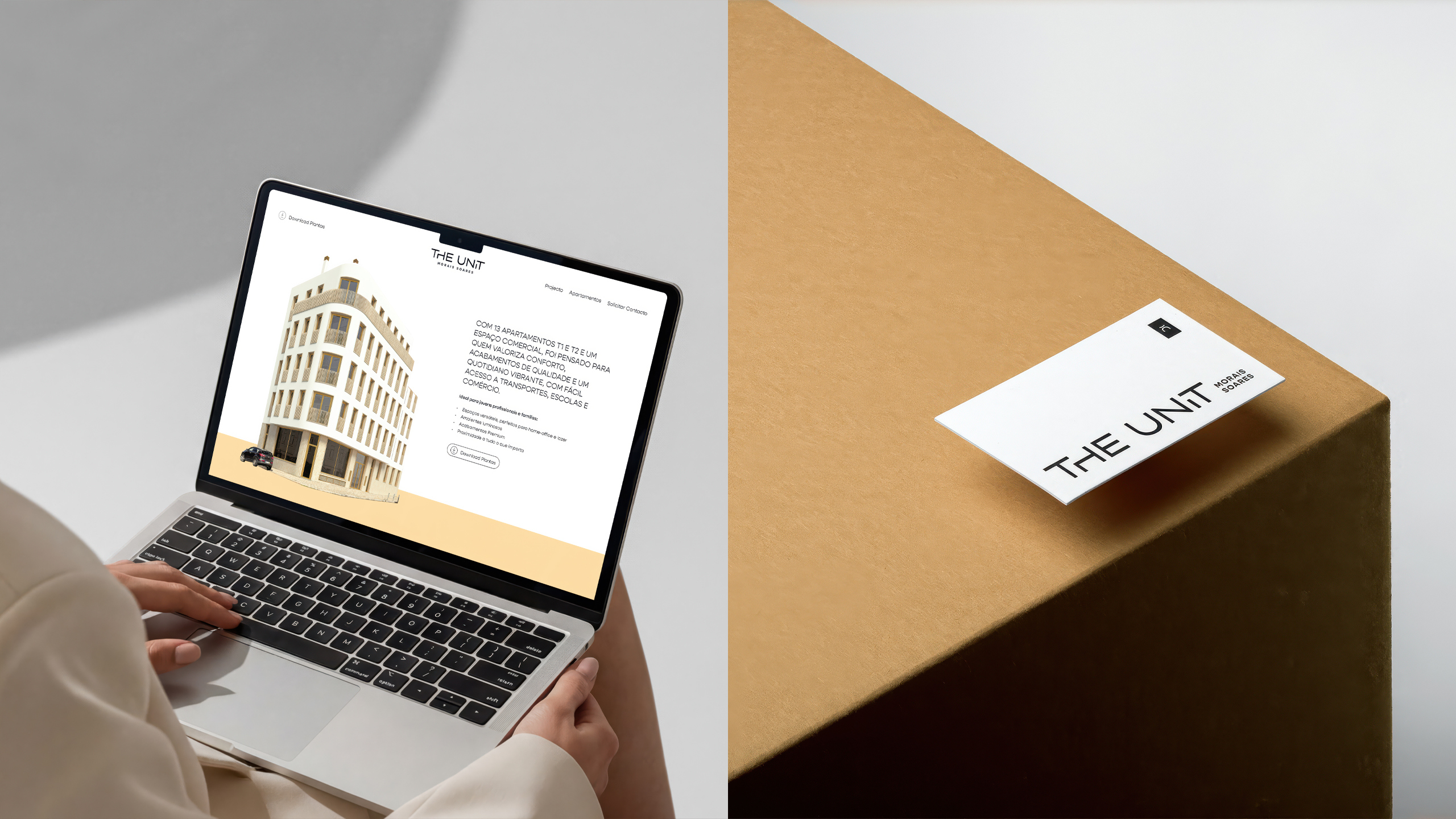
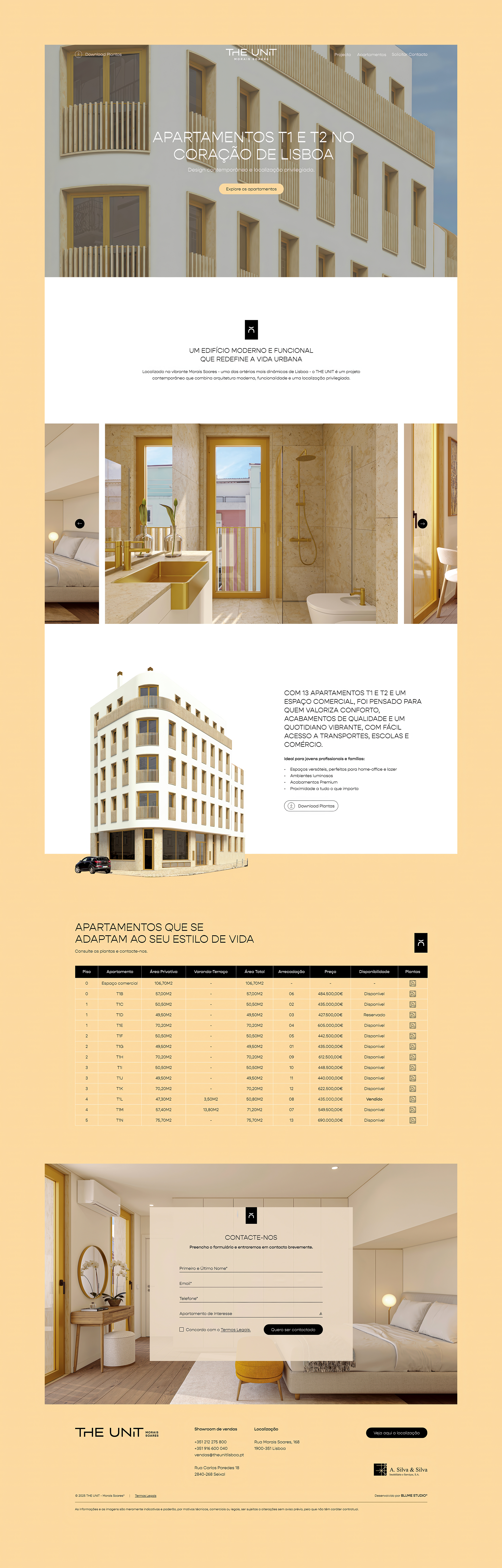
The website translates the brand into a minimalist one page experience, combining strong colour blocks and clean modular sections to highlight typologies, location and key features, maintaining its youthful and contemporary character across every touchpoint.
Thanks to:
Luana Bercovici – Designer
Hugo Almeida – Brand Name
Pedro Rosa – Developer
Miguel Estevinha & Filipa Viegas – 3D Artist
By clicking “Accept All Cookies”, you agree to the storing of cookies on your device to enhance site navigation, analyze site usage, and assist in our marketing efforts. View our Privacy Policy for more information.